 Bootstrap contains CSS- and JavaScript-based design templates for typography, forms, buttons, navigation, and other interface components.
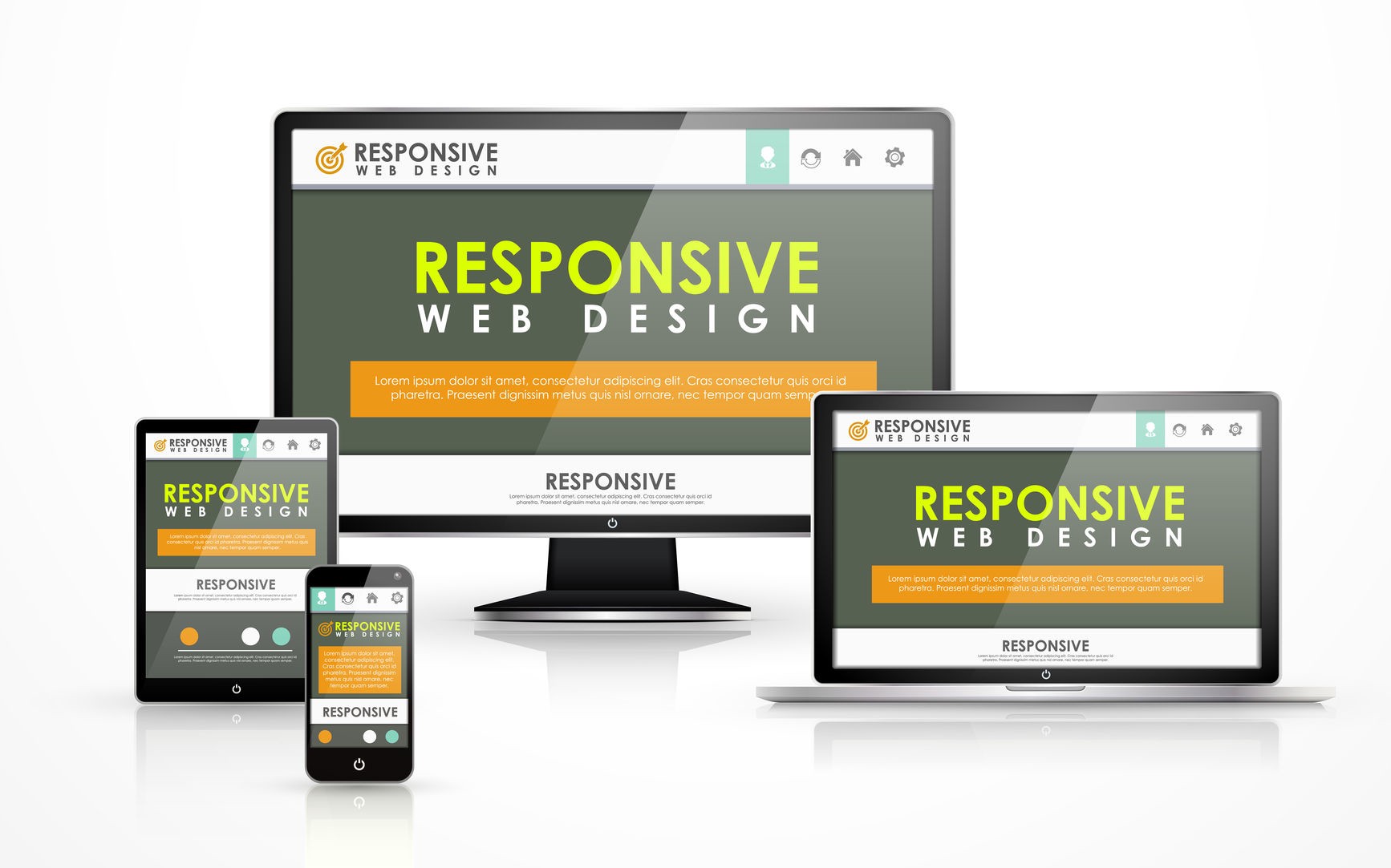
Here is the way to add images to fit based on webbrowser and resolution without bootstrap. These responsive images can be achived by settings classes for image tag using style.
HTML tag:
Bootstrap contains CSS- and JavaScript-based design templates for typography, forms, buttons, navigation, and other interface components.
Here is the way to add images to fit based on webbrowser and resolution without bootstrap. These responsive images can be achived by settings classes for image tag using style.
HTML tag:
<p class="bodytext"><img alt="w3dummies" height="516" src="https://www.w3dummies.com/wp-content/uploads/2020/02/open-source.png" class="responsive" title="w3dummies" width="600" style=""></p>
Responsive css class:
img.responsive {
margin: auto;
box-shadow:0 0 25px #111;
-webkit-box-shadow:0 0 25px #111;
-moz-box-shadow:0 0 25px #111;
max-width:1024px;
width: 100%;
height: auto;
} Apply this style to image using responsive class. Image will be shown full view maintaining aspect ratio.


Leave a Reply